Zach Taylor Work Blog (Wk14)
Total Weekly Hrs: 10 Hrs
Menu Updates/ Font changes: 3.25 Hrs
Playtesting and Updating Quest: 3.5 Hrs
Refine Blueprints and Update Widgets: 3.25 Hrs
(Fig 1)
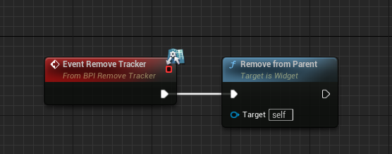
I initially wanted the tracker widget to be toggleable on the quest log screen through a blueprint interface. In (Fig 1) is where I tried to connect the event to the removal of the widget.
(Fig 2)
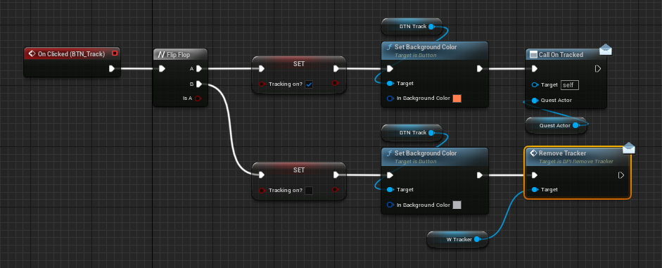
(Fig 2) shows the inside of the tracker widget where I tried to set up a boolean through a flip flop node to change the color of the tracker button depending on what quest was actively being tracked or not. The nodes in (Fig 2) were able to flip flop the colors but they never were able to actually remove the tracker widget, it can only be switched. When the quest log is closed and reopened both quests have a gray track button next to them even if tracking is active. I ended up removing the flip flop node and just have it set to turn coral when Call On Tracked is activated. This is a better indicator than previously of when a quest is being tracked.

(Fig 3)
I wanted to set up an interface where the quest giver would display a question mark over their head before the quest has been accepted. When the player accepts the quest the question mark widget is supposed to be removed. (Fig 3) shows the Remove Question Mark event being called after the Accept button has been pressed in the widget.
(Fig 4)
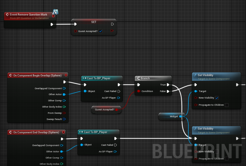
(Fig 4) shows that when the event is activated a boolean should be set to positive for quest accepted. If quest accepted is positive I wanted it to remove the question mark widget. This interface configuration did not do anything because of the many different blueprints dealing with the quests and widgets not being able to communicate with other blueprints.
(Fig 5)
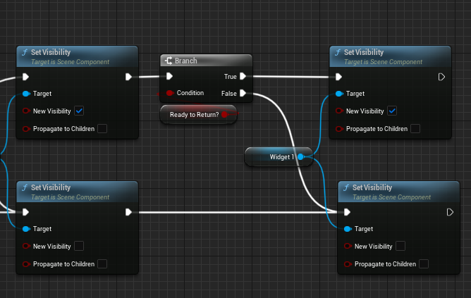
In (Fig 5) after the player accepted the quest I wanted the overhead widget of the quest giver to change to an exclamation point after the player has gathered the key, so I set it up to the same boolean as the trigger location objective for returning to the witch after the player has the comb. This did not spawn the new widget and I ended up deciding to remove the question mark widget completely. I now have the quest giver only showing the exclamation point to still signify a shift between the npc dialogue and accepting of the quest.
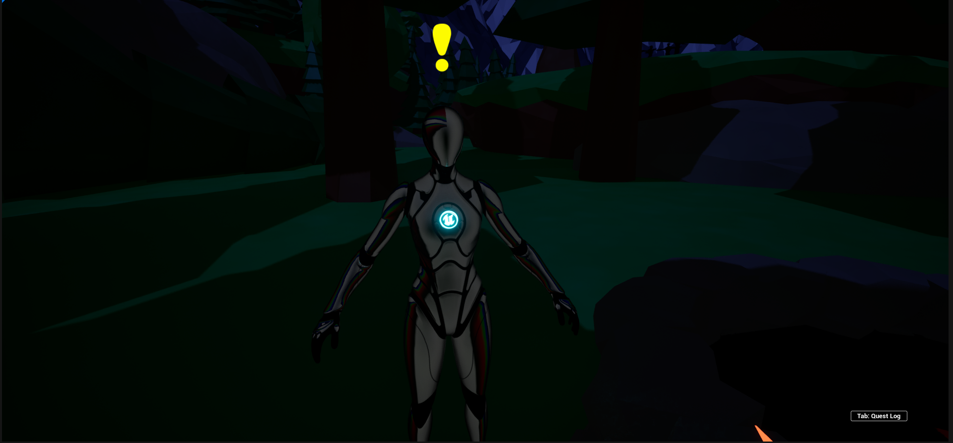
(Fig 6)
In (Fig 6) an in game view is shown of the new exclamation point over the quest giver mentioned in (Fig 5), the exclamation point also has a small animation where it floats up and down.
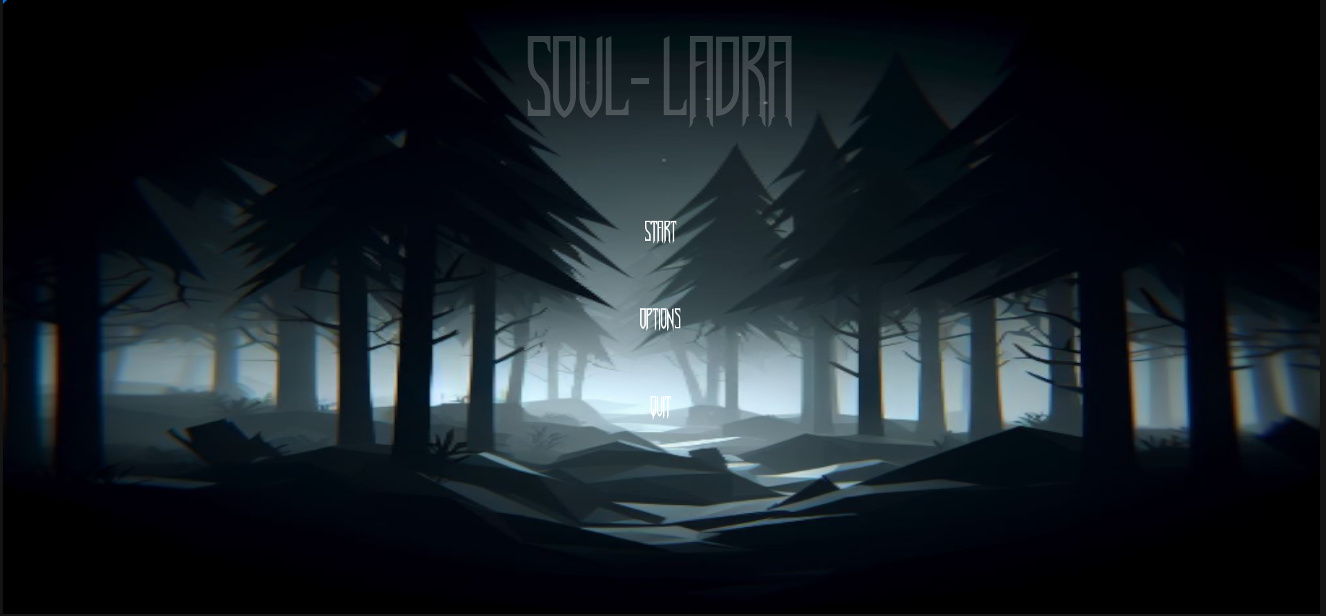
(Fig 7)
(Fig 7) shows the updated main menu with the new font and title included. I feel like this font goes well with the horror genre and is still fairly easy to read.
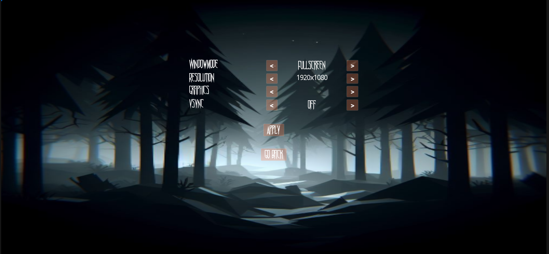
(Fig 8)
I also updated the font and formatting in the options menu which can be seen in (Fig 8). The arrows to adjust the settings no longer move when the setting names have different character lengths. The entire screen was centered and all the arrows and settings text have the same formatting.
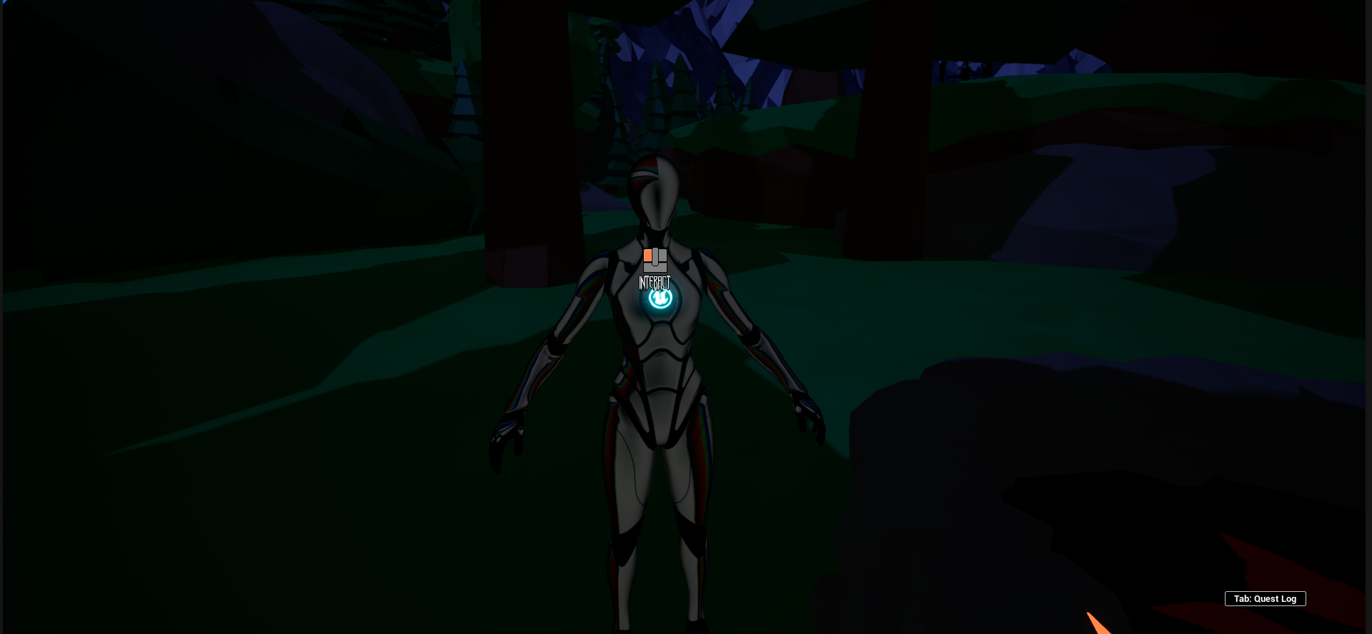
(Fig 9)
In (Fig 9) I updated the interact widget so that it just has an image of a left click mouse and the word interact. I feel like this is a cleaner presentation. I decided to make the left mouse be the coral color because of our current palette and its large contrast to the environment.
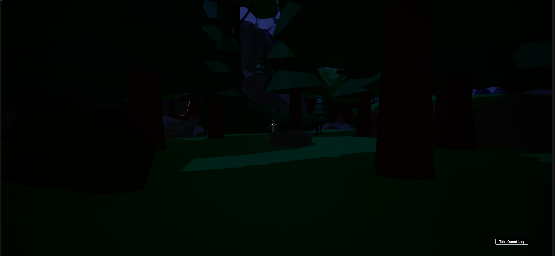
(Fig 10)
In the bottom right corner of (Fig 10) I added a Tab: Quest Log icon to the player’s HUD so that they know the quest log exists and how to open it. I also made sure to align the icon with the bottom right corner of the quest log when it appears.
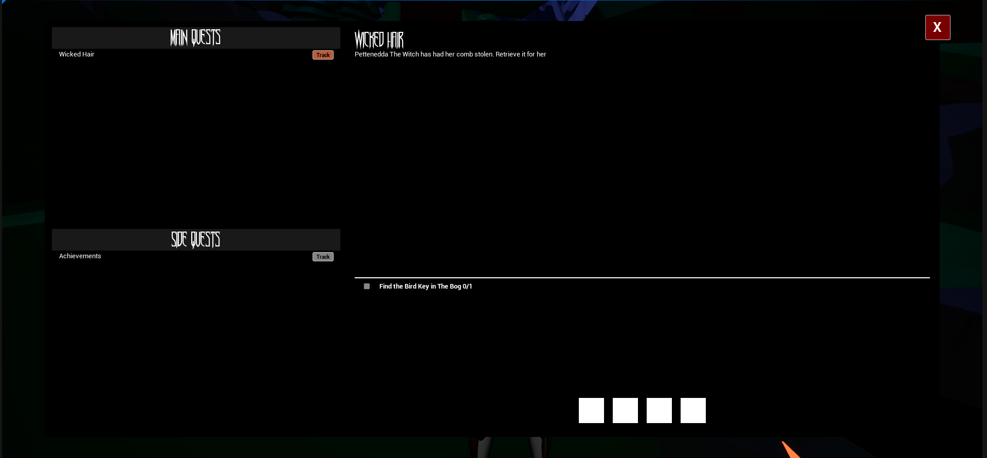
(Fig 11)
(Fig 11) shows the updated quest log with the new font being used and the track button color change update that was mentioned in (Fig 1 - Fig 2).
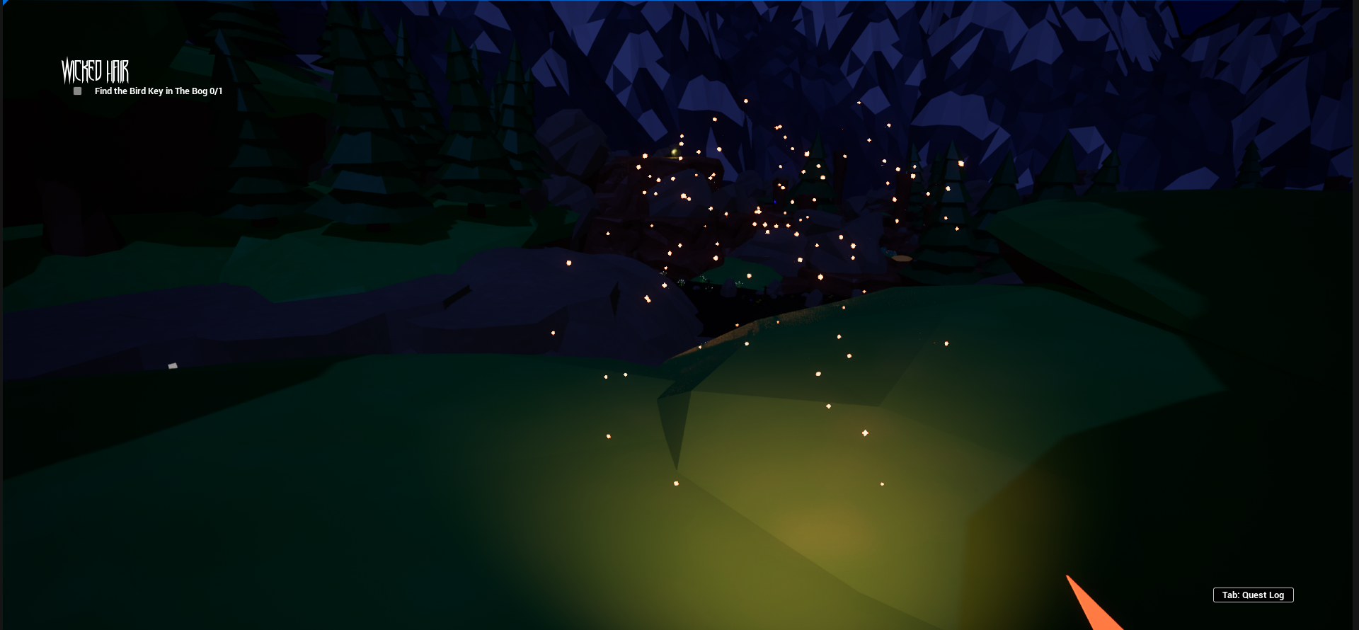
(Fig 12)
In (Fig 12) I added a Niagara burst to the initial activation of the coral horn. This is when the player can actually harm the enemy and I feel like it makes it much clearer to the player that the initial activation has a different effect then just having the light on.
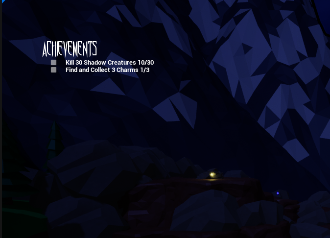
(Fig 13)
I decided to update the Achievements side quest and made it so you have to kill more shadow creatures due to the large quantity. I also made Andrew’s charms collectable with one being shown in the distance with the glowing gold light shown in (Fig 13). I feel that this adds a literal variation to the gameplay.

(Fig 14)
(Fig 14) the updated shadow creature blueprint where I decided to differentiate their normal movement speed and increase their speed when chasing the player. This gives the player much more of a spooked reaction to the enemies.
Get Soul-Ladra
Soul-Ladra
First-Person Horror-Adventure with Italian Folklore
| Status | In development |
| Author | NitrogenGhoul |
| Genre | Survival, Adventure |
| Tags | 3D, Creepy, First-Person, Folklore, Horror, Low-poly, Narrative, Retro, Singleplayer |
More posts
- David R. Work Blog Week 15Dec 01, 2023
- Week 15 DevLog_KUNov 29, 2023
- Week 15 Work Blog - Irie TurnerNov 29, 2023
- Zach Taylor Work Blog (Wk15)Nov 29, 2023
- Week 15 Dev LogNov 29, 2023
- Dev Log Week 14Nov 29, 2023
- Week 14 Work Blog - Irie TurnerNov 22, 2023
- David R. Work Blog Week 14Nov 22, 2023
- Week 14 DevLog_KUNov 21, 2023

Leave a comment
Log in with itch.io to leave a comment.